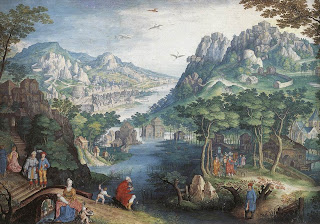
 Gillis van Conninxloo’s watercolor painting “Mountain Landscape with River Valley and the Prophet Hosea” can be used to illuminate many of the aesthetic principles used in evaluating design. Art may be pretty to look at, but it is only in breaking down the image can we discuss the visual effectiveness of a work. For this example we’ll be ignoring the historical context of the painting and solely focusing on the visual components.
The first impression a viewer gets from “Mountain Landscape” is the overarching hills in the background. The mountains are the most important element in the hierarchy of the painting. First the viewer sees nature, the mountains, the river, the trees, and then the viewer becomes aware that the hills are made up of buildings. Bridges and paths are built into the landscape. Then the viewer sees the people in the foreground. Finally, the least important detail is that of the birds in the very center of the sky.
The colors of the background are very muted and pastoral. They consist of rich greens and grays. The people on the other hand, are clothed in bright blues and reds. This sets them apart and contrasts them from the background. This focuses the attention as humanity as other, as apart from nature.
Coninxloo uses scale efficiently in this work. In order to create such a landscape, and to create the illusion of distance in a 2D work, it is necessary to play with scale. The houses over the river in the center are about the same size as the people in the foreground. This gives the illusion of the buildings as being far away in the distance. However, the artist also plays with tension here. The people aren’t quite to scale, the mountains are a bit too close together, the river too perfect. It makes for an intriguing visual.
What is especially nice about this painting is the way the artist has set up the flow of the work. The viewer’s eyes are drawn to the mountains first, then slowly begin to focus on the individual details. The viewer realizes there are houses in the mountains, some over water and there is a little boy fishing in the water. The eye is captured from a distance and enticed to look closer.
The artist balances the landscape appropriately. The mountains are placed symmetrically, though the hills on the right are slightly closer and larger. Townspeople on either side of the river are walking towards the water. Trees and greenery are slightly stronger on the right hand side, contrasting with the darker coloring on the left.
This entire image is held together by the river in the center. The river winds its way, like a path, from the very center of the mountains towards the viewer. There are many paths, stairways, and bridges, all man-made, that mimic this motion throughout the painting.
This painting is a lovely piece of artwork. It utilizes many principles that make design aesthetically pleasing. But is the only purpose of art to hang in a museum and look pretty? How else can a designer make use of such an image in a commercial sense?
There are multiple possible uses for such an image. It would make an excellent wraparound cover for a textbook, perhaps on history, psychology or even art. The painting can also be used in advertising for a variety of products. It could be the background of an ad for allergy medication. Perhaps the muted colors and imagery would work well to sell items that emphasize graphics. Those include photo editing software, Macintosh computers or high quality color printers. I can visualize an ad where the painting is being printed from one of these printers and the quality matches the painted copy on the wall. The painting could fit in on a church newsletter or other publication, although the image is not strictly religious despite its title.
Although the artist had a context for his painting, the work can also be discussed on its visual elements alone. By analyzing each element, the viewer can see how these principles result in good design.


No comments:
Post a Comment